
Why Typography Matters
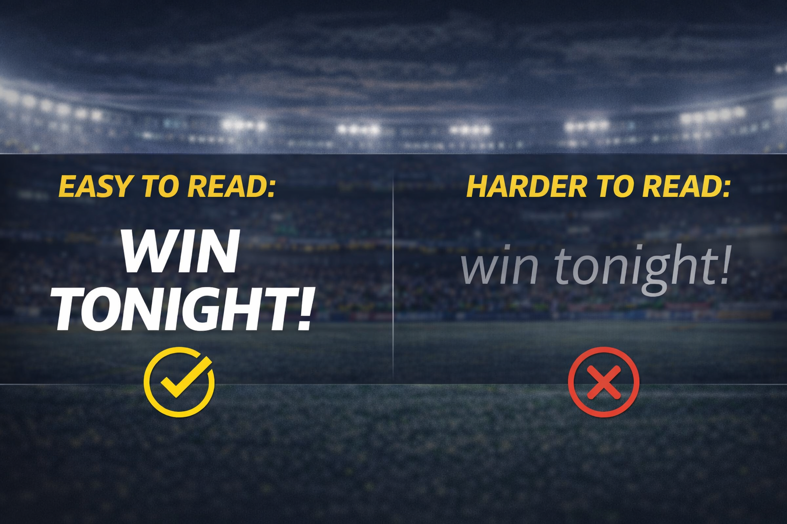
Created By OpenAi
If you ever watch sports tv, typography is probably one of the first things that catches your eye as long as you are aware of it. It’s everywhere, scoreboards, lower thirds, promos, ads, etc. And it has one job: to communicate information immediately. Sports typography has only one rule that is unlike other types of typography: it has no time to lose. If it’s not legible immediately, it’s a failure.
One of the first things that catch the eye is how uncreative most sports typography really is. Sports typography is bold, condensed, and easy to read. When first looked at, it might look like a lack of creativity, but it’s actually the opposite. This is due to the pace at which sports content is delivered. People are too busy watching the game to pay any attention to a graphic so it has to be legible at a glance, there is no time to look at it carefully.
What stands out to me is how legibility can be different based on the context. Sports ads, for example, are mostly seen from a distance, on a screen, or while something else is playing on the screen. This is why contrast in color is so important. For example, white text on a dark background, bold yellow color accents, and clean fonts are used most often due to their high visibility at a distance. Sports networks such as ESPN use strong typography systems to keep legibility throughout their broadcasts (https://www.espn.com).
Another important aspect of typography in sports advertising is how it’s used to create visual hierarchy. For example, there is often a lot of information being shown at one time, like team names, times, and scores. This highlights what is being shown to the viewer first. Another example is a larger font may catch someone's eye, while smaller text gives more information. This has to make sense to the viewer immediately. Resources such as Creative Bloq show how important it’s to have hierarchy in a design system to allow information to be processed quickly (https://www.creativebloq.com).
Another thing that becomes clear when watching sports ads is how typography is related to energy and tone. A bold font is powerful and fast, just like sports. Even small differences in font weight or space can have a large effect on the overall feel of a graphic. The small details have a big impact on how they are seen.
Typography is also related to motion. Text does not simply appear on the screen. It slides in or fades in. This is important for giving the text weight. A title that quickly appears on the screen is important, whereas a title that fades in is not as important. This is another way in which typography is not simply about what is written but also about how it’s written.
The more sports broadcasting events I watch, the more it becomes apparent that typography is playing a huge part in how information is presented, how it’s structured, and how it’s received, all at once. When there is a limited time to take in what is being shown, it’s clear that typography plays a large part in how designers can use it as a tool. Sports advertising clearly shows that good typography is not an aesthetic issue, it’s a communications issue. When it’s good, it’s great; when it’s bad, everything else on screen suffers to varying degrees.

A collection of my observations as a designer, breaking down the small details, trends, and creative choices I notice in sports, media, and digital design.
