
The Psychology Behind Sports Ads
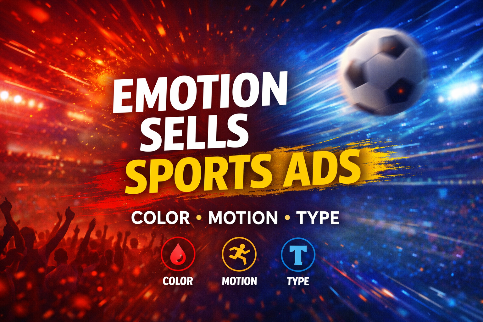
Created By OpenAi
Emotion is already a part of the sports viewing experience. The close games and plays, the crowd reactions, they’re all part of what makes sports an emotional experience. What I have come to realize is the way that sports advertising uses emotion in the design of certain advertisements. The design of these sports ads is not random, it’s meant to create an emotion that is already being felt by the viewer of the sports game.
One of the most obvious design choices is the use of color. Sports ads always seem to use bright, vibrant colors such as red, yellow, and bright shades of blue. Not only do these colors stand out on a tv screen, but they also create an emotion. The color red is often associated with urgency and intensity. The color yellow grabs the attention of those who are viewing it. According to an article by Creative Bloq, color is a major factor in how quickly a viewer is able to process information (https://www.creativebloq.com).
Another thing that caught my attention is the use of sports ads featuring important moments. Rather than displaying the entire action, the ads often focus on the reaction to the action, such as the player celebrating, the crowd cheering, or the close up before the moment. These images are often used with motion blur or quick cuts, which make everything feel faster paced. In terms of design, this is about grabbing the viewer's attention immediately.
Another aspect of motion is the way in which emotions are shown through the design. The quick cuts, zooms, and motion all contribute to the ad. When I began to pay attention to this, I noticed that motion is not simply about creating an aesthetically pleasing design, motion is about controlling the viewer's emotions. In an article on motionographer, the role of motion in design is discussed as a means to control the viewer's emotions through the use of motion: “Motion design is not just about creating motion graphics; it's about creating emotions through motion” (https://www.motionographer.com).
Typography plays a role in this too. A bold, condensed font can have a powerful, aggressive feel to it, which could be fitting for most sports ads. How the text comes onto the screen can play a role too. A title that enters the screen quickly or snaps into place can have more impact than one that enters the screen more slowly. These elements all play a role in contributing to the feeling of the ad.
What makes sports advertising different from other forms of advertising is that it does not have to create emotions from scratch. Instead, it can work off of what is already happening in the game. Design can then serve to bring out those emotions and use them through the breaks in the game. That is why sports ads tend to feel more intense than other ads. The more I look at sports broadcasts, the more I believe that good design is not simply about aesthetics. It is about understanding how people feel in the moment and designing in a way that meets those feelings. In a live sports environment, where there is limited space for the viewer's attention, I believe this is one of the most significant aspects of graphic design.

A collection of my observations as a designer, breaking down the small details, trends, and creative choices I notice in sports, media, and digital design.
