PACKAGING DESIGN / BRAND EXTENSION
Casamigos
Tequila Seltzer
Explore a curated collection of our past work, where imagination meets strategy. Each project reflects our drive to deliver thoughtful, effective solutions.
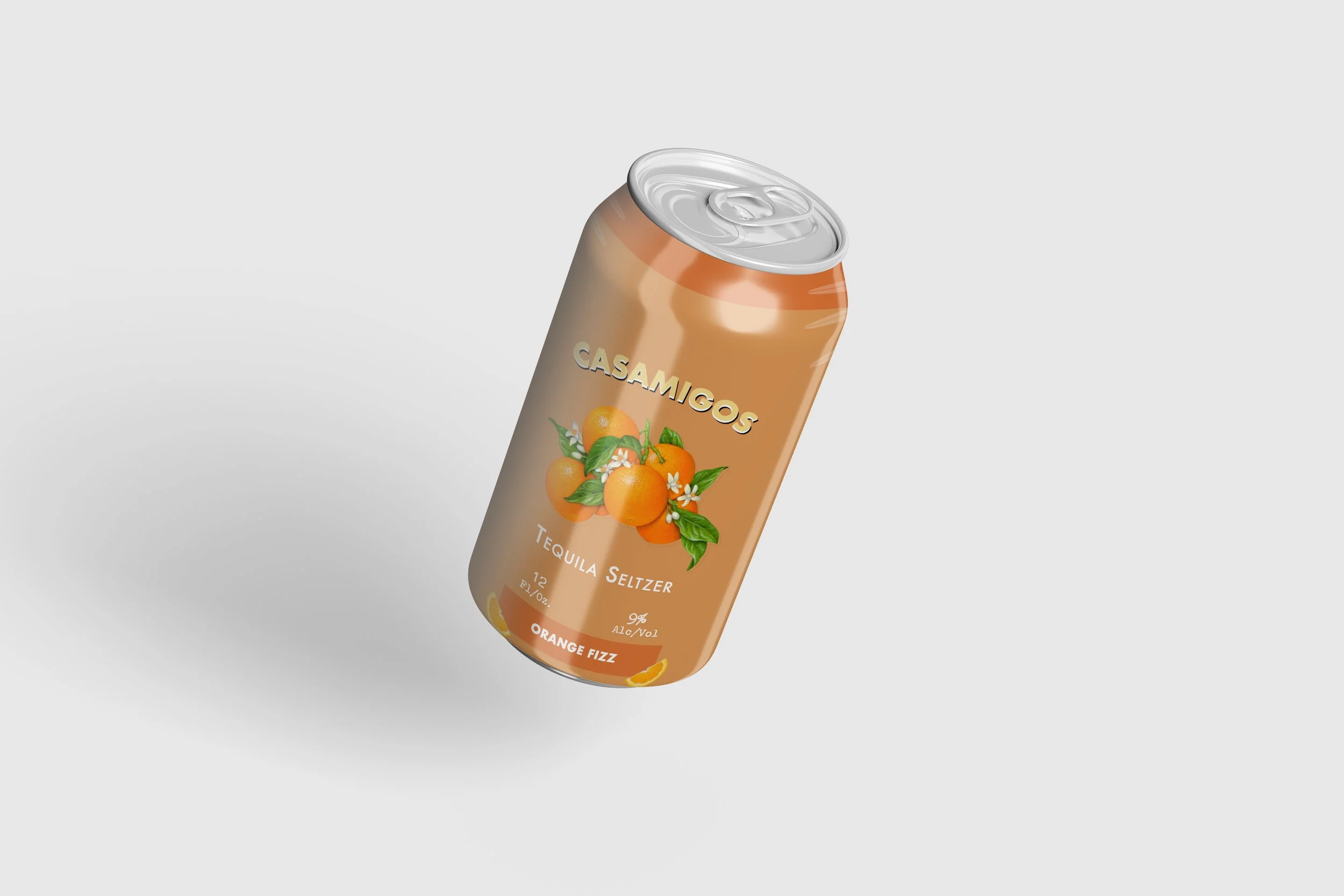
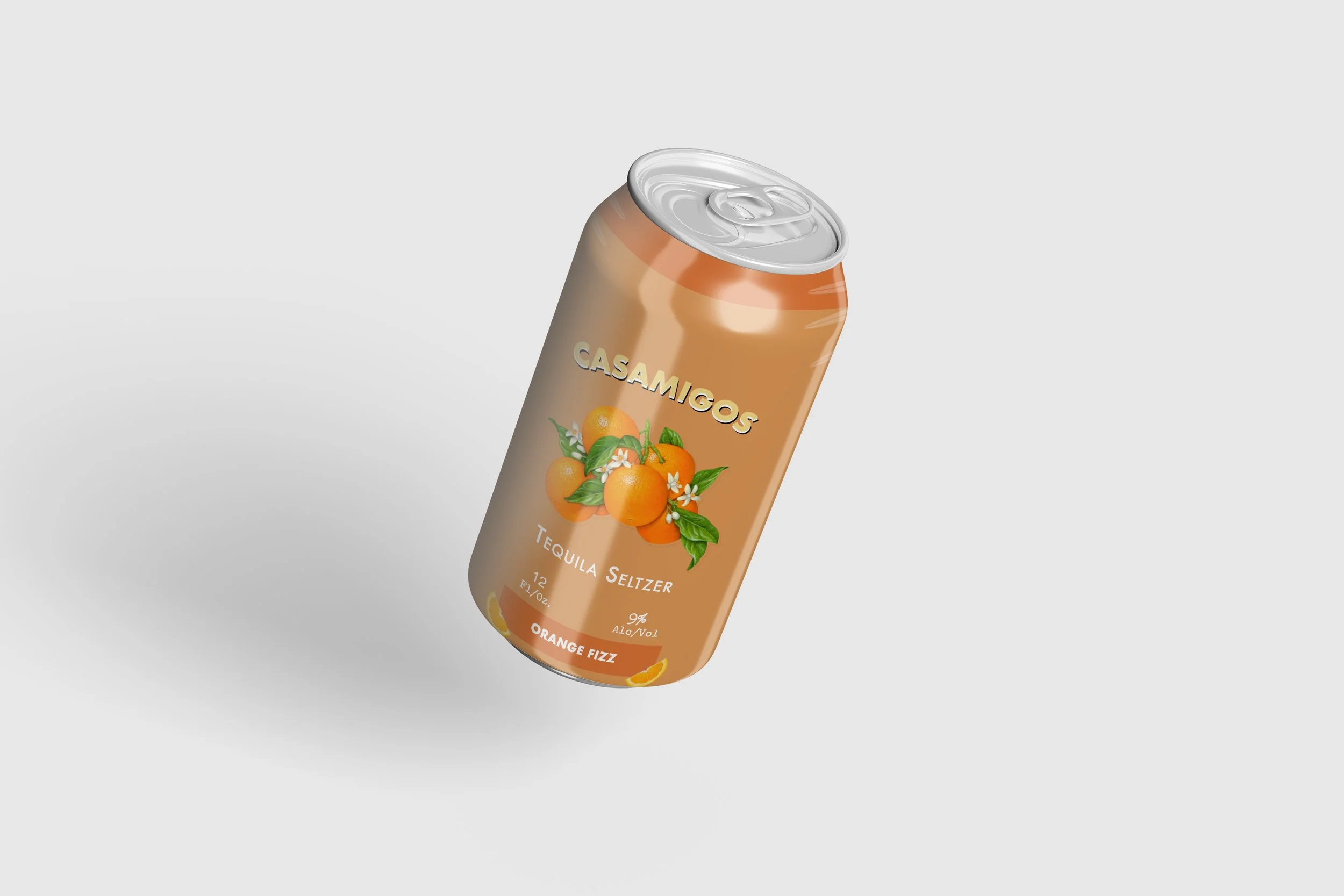
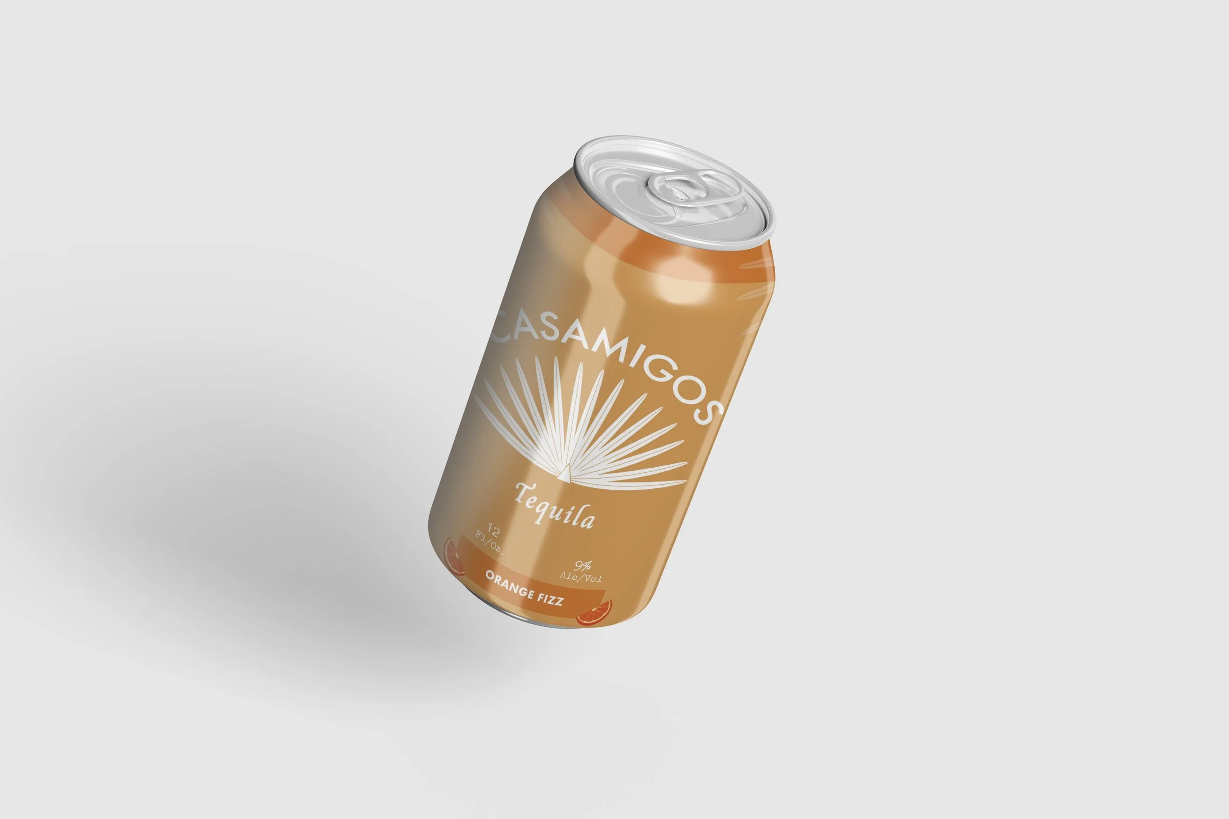
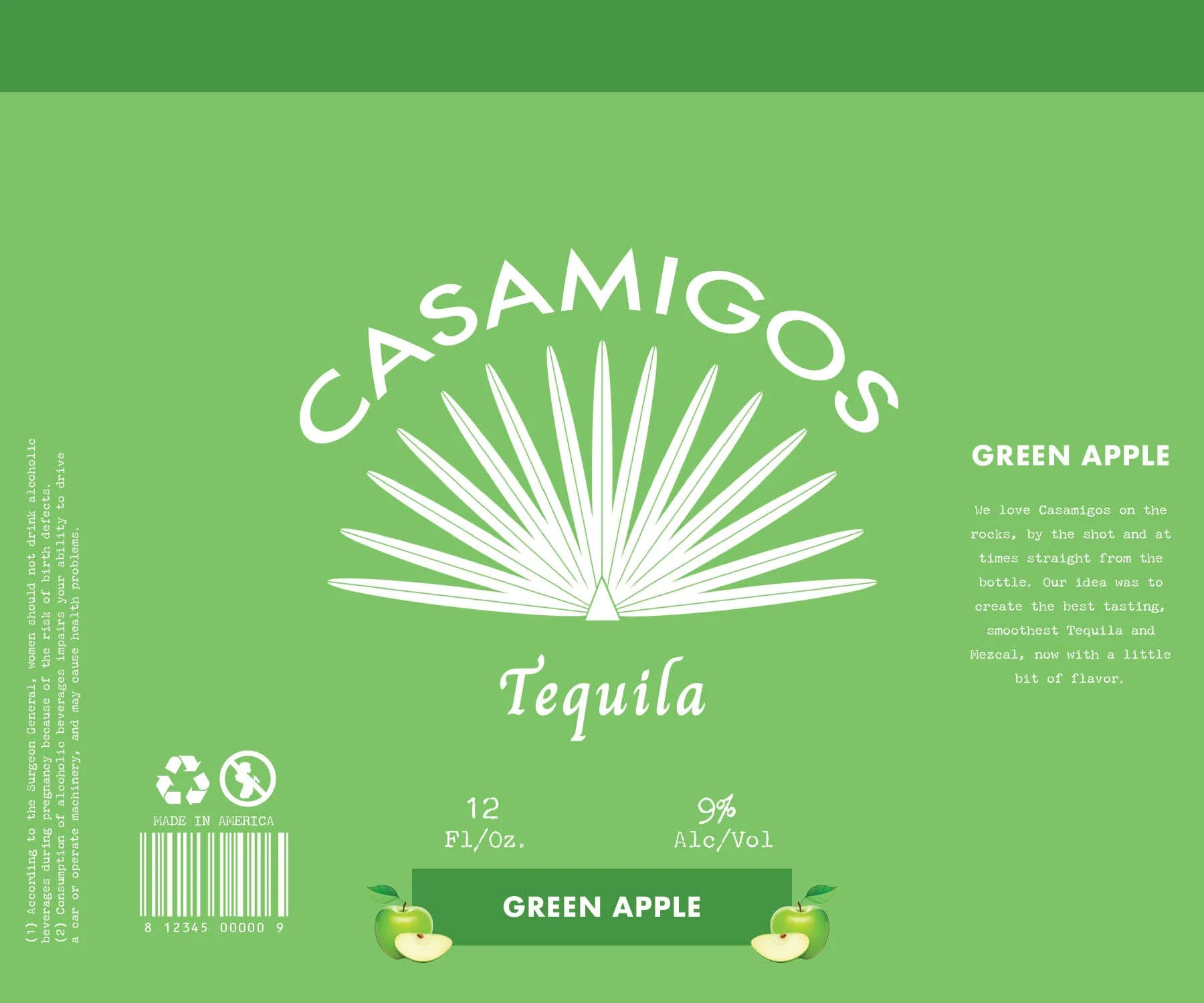
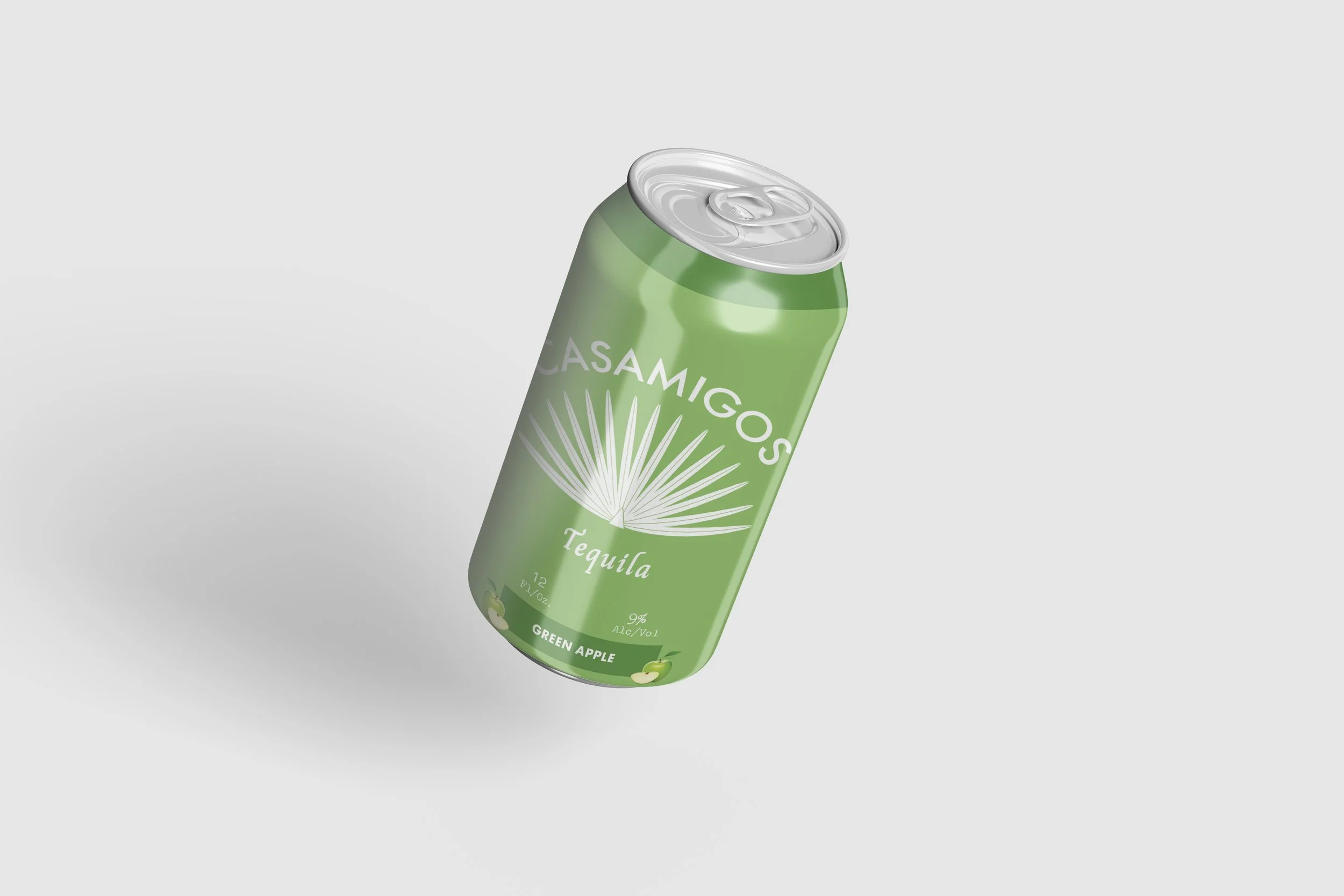
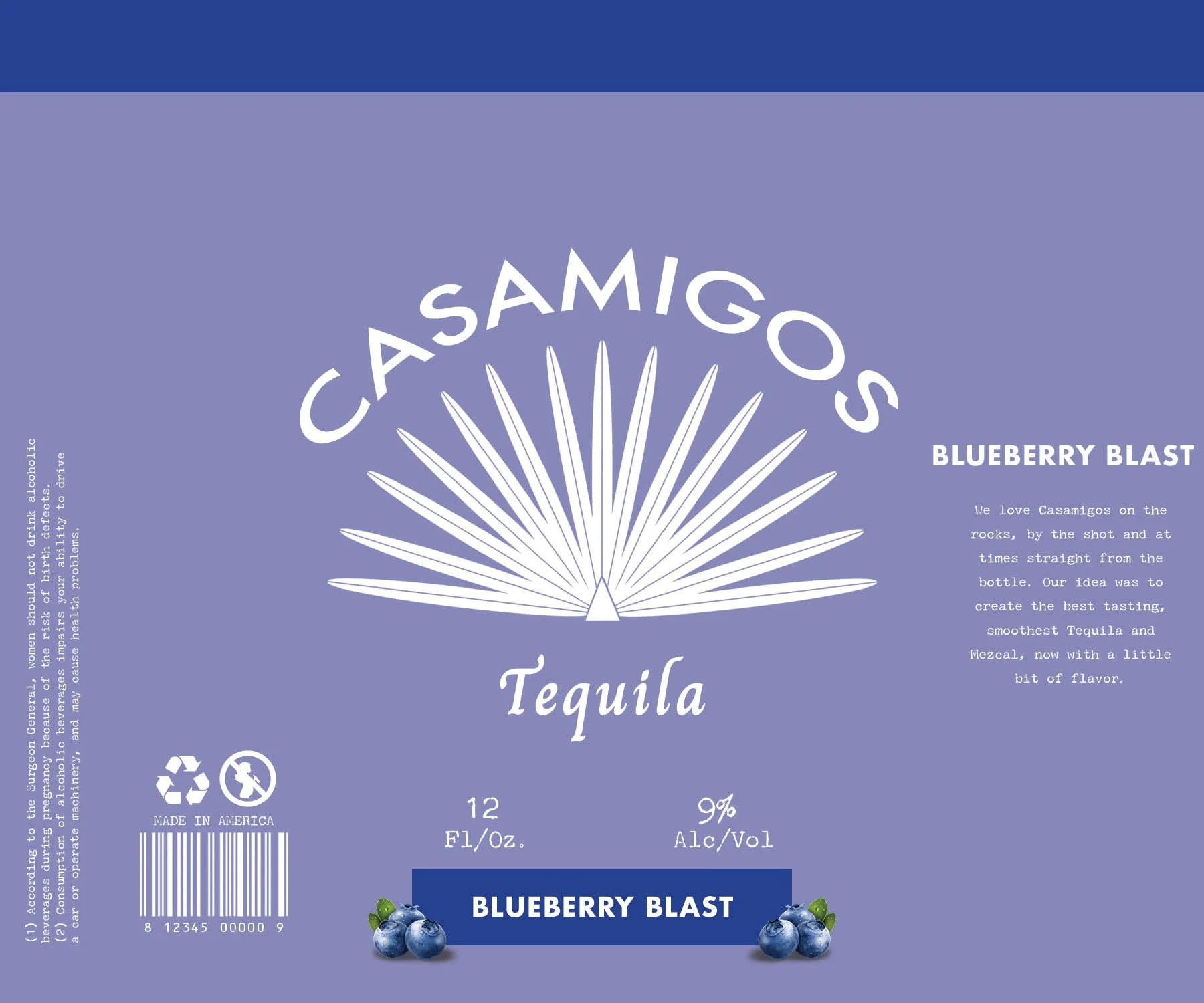
This project explores how Casamigos could extend beyond its core bottle packaging into a flavor-forward canned seltzer line. Instead of following the loud visual language common in the category, I built a packaging system centered on hierarchy, restraint, and flavor clarity.
The final system includes three flavors—Orange Fizz, Blueberry Blast, and Green Apple—designed to work as a scalable product family.
Creating a tequila seltzer line that still feels premium
OVERVIEW
THE PROBLEM / DESIGN CHALLENGE
How can Casamigos enter the RTD market while keeping the same brand identity?
Casamigos needs a packaging system that allows entry into the tequila seltzer market while preserving its premium brand identity and avoiding the visual clichés of mass-market flavored alcohol.
PROCESS
Showing the design develop from research to final product
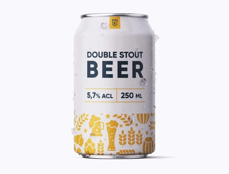
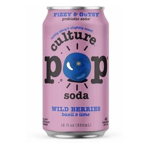
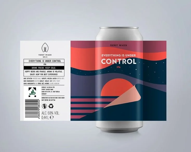
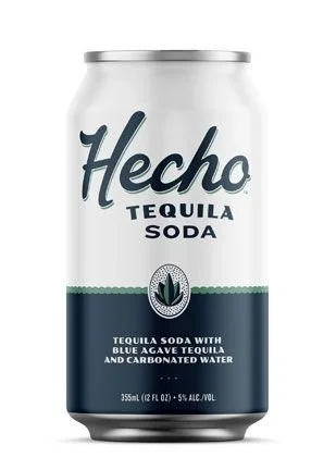
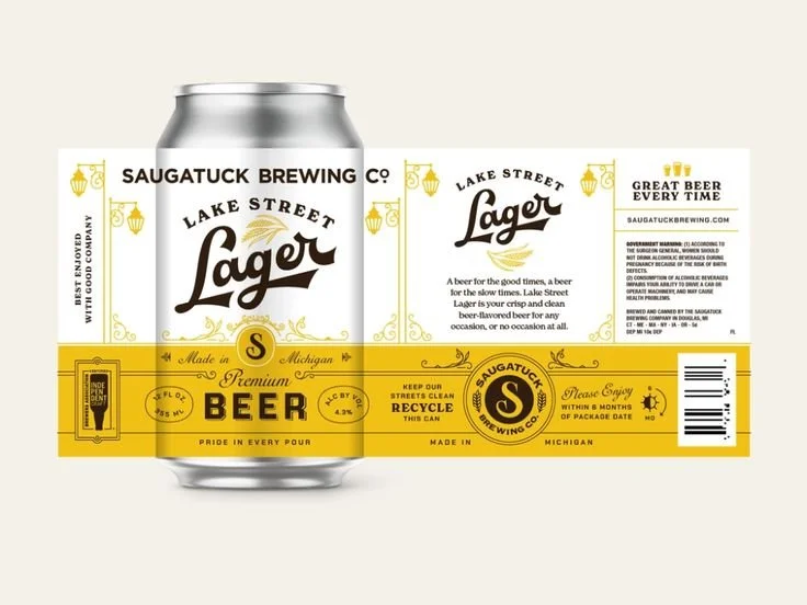
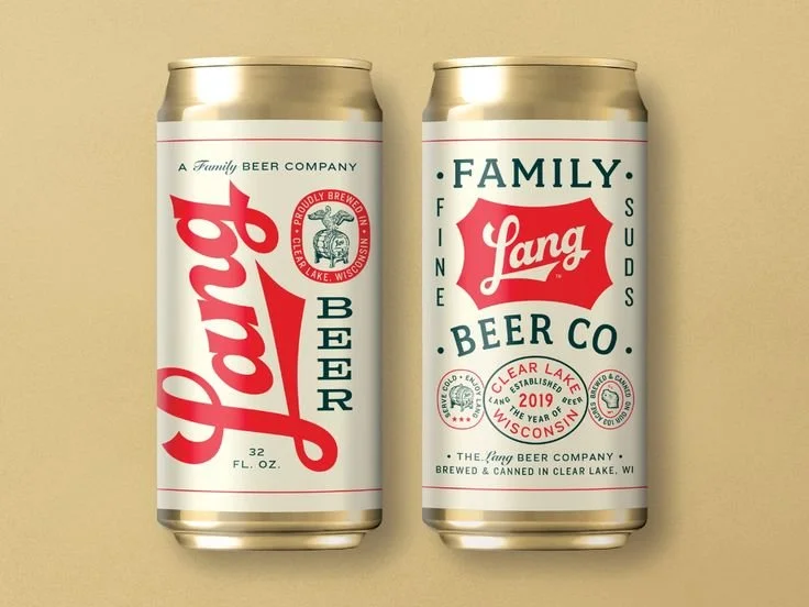
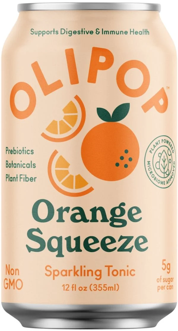
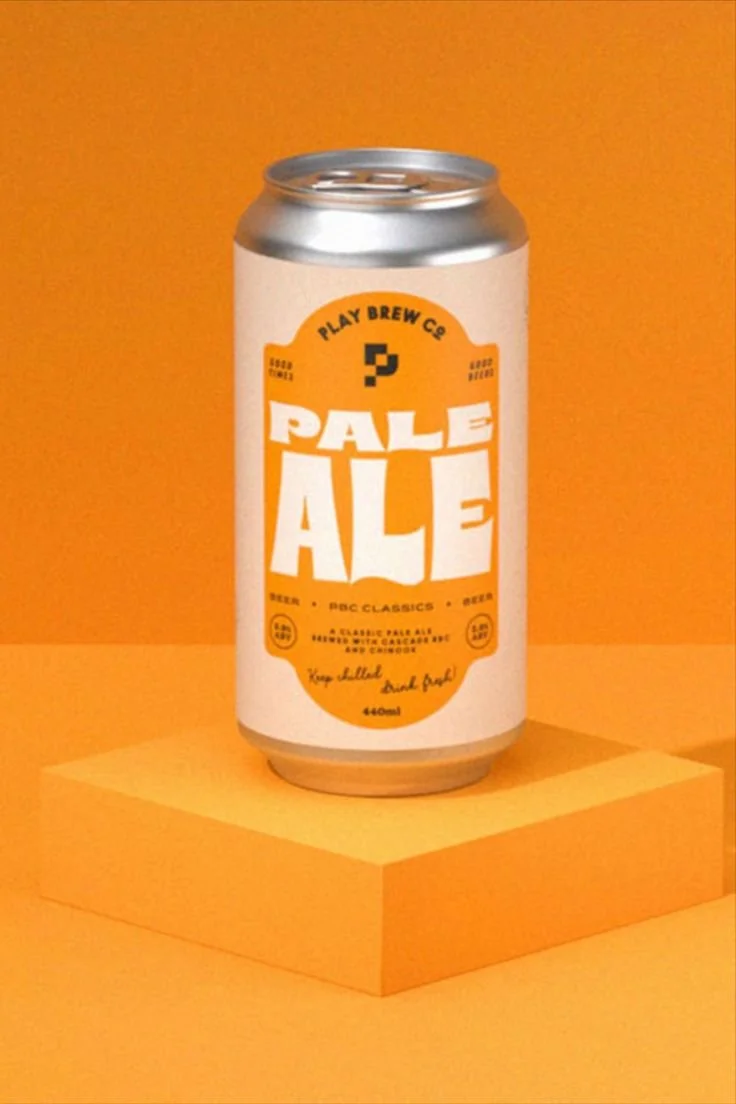
Inspiration


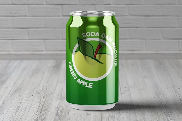
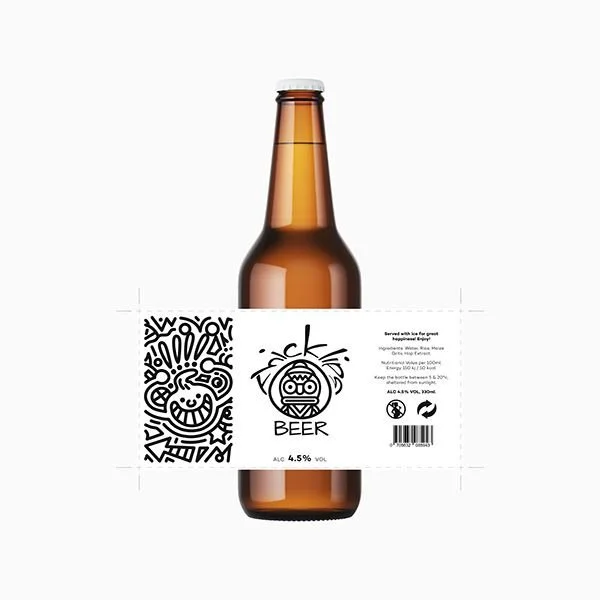

PROCESS
Type Study
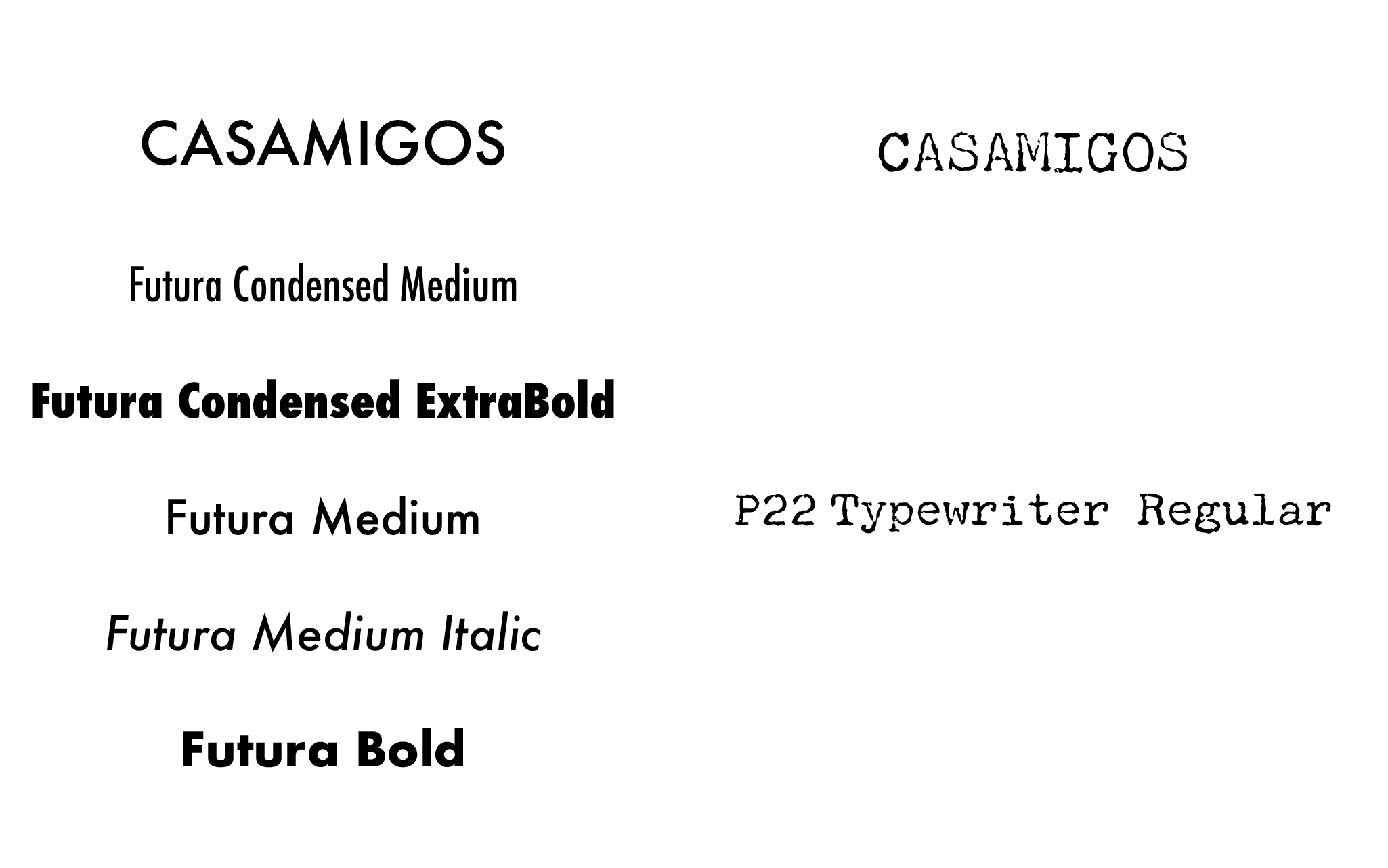
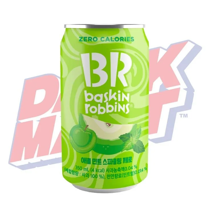
I explored type pairings that could hold onto Casamigos' established character while adapting to a more contemporary canned format. The goal was to keep the wordmark recognizable and the supporting typography structured and easy to scan.
Color Compositions
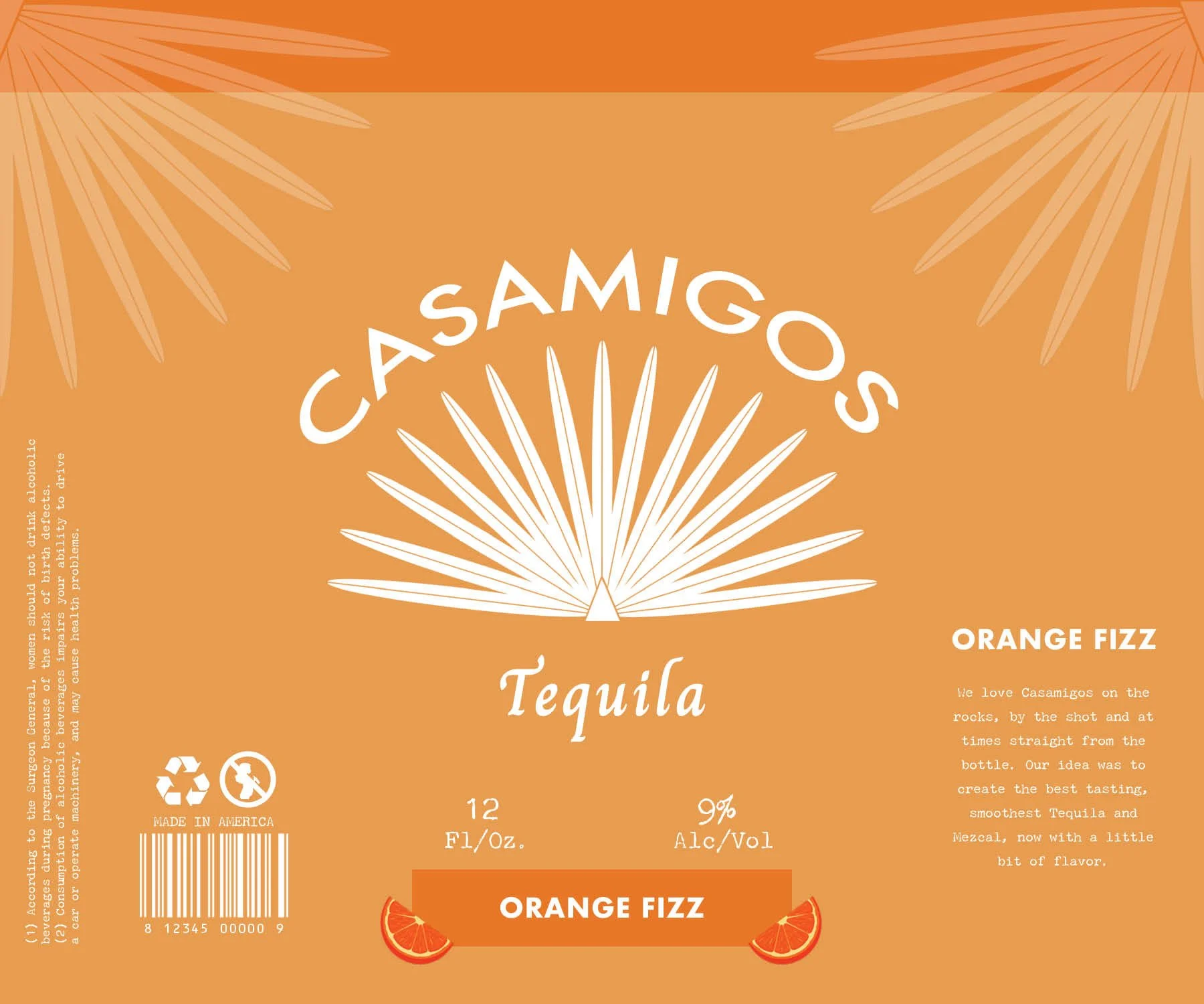
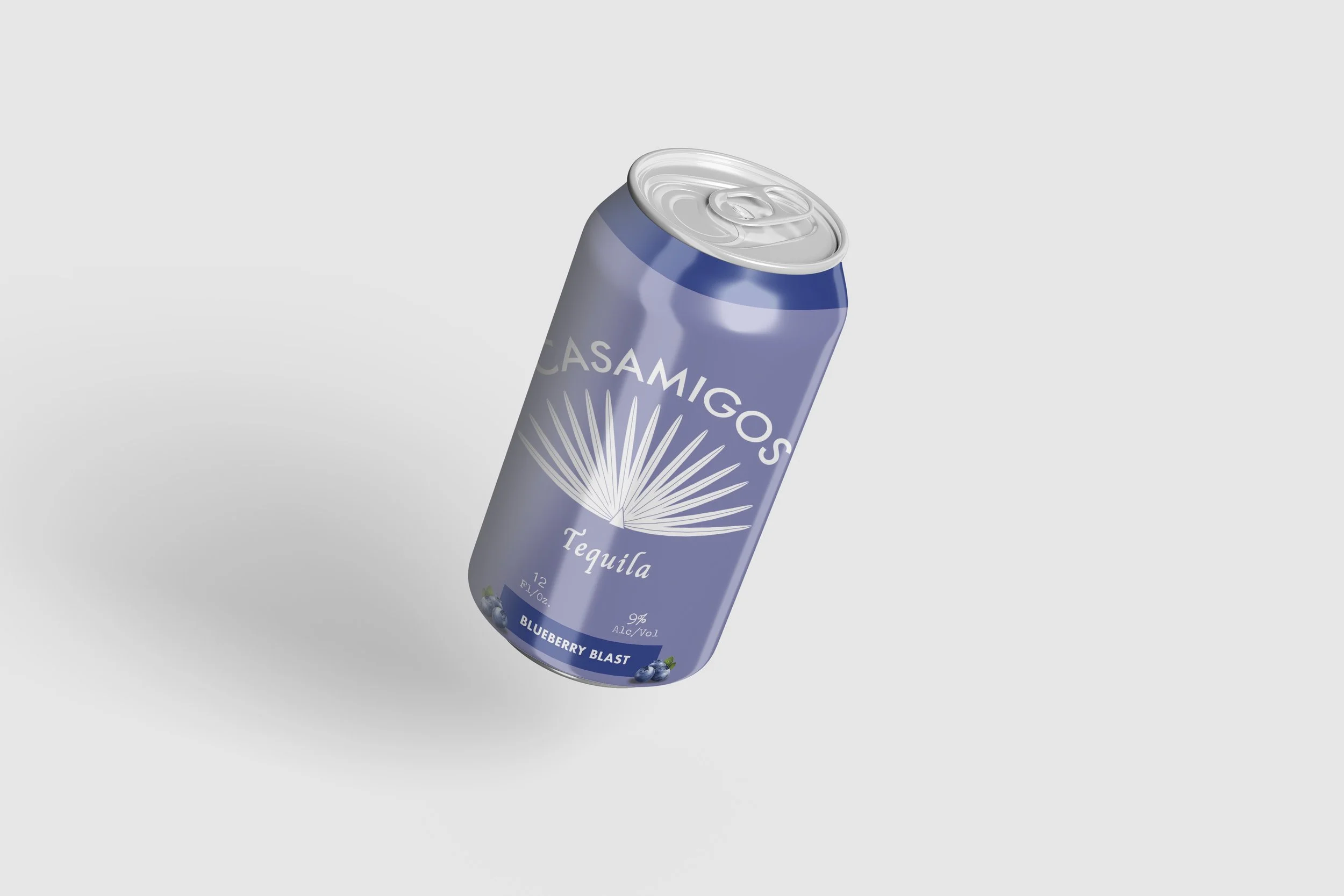
FINAL DESIGN
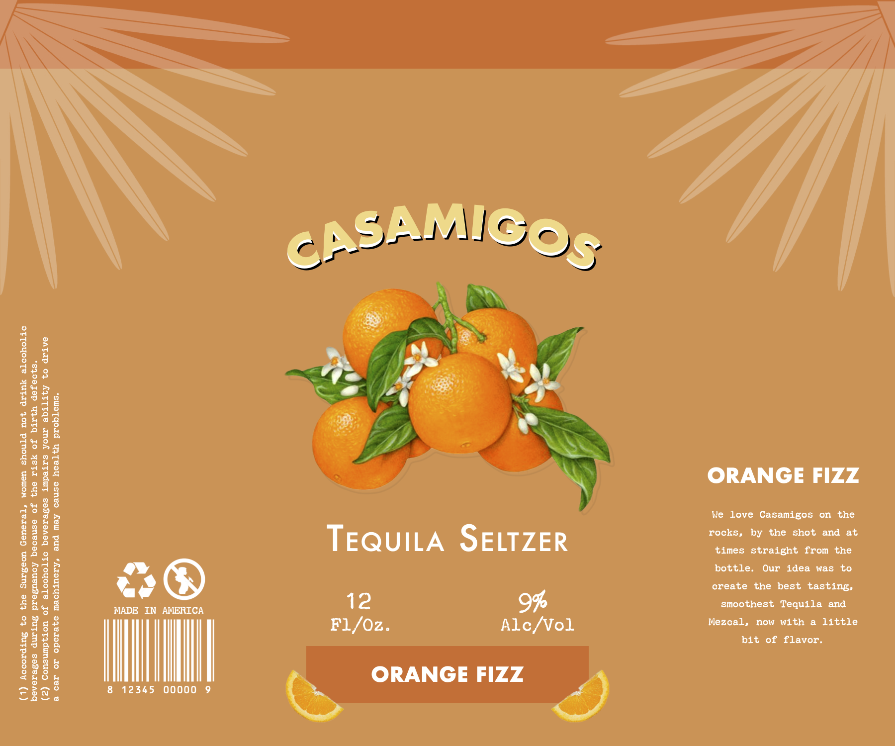
A flexible flavor system built around one consistent structure